
You look great in the mirror. Then you see the photo and wonder who that washed-out stranger is. If you’re asking what colors make you look good in photos, here’s the good news: photogenic color is predictable — it’s about contrast with your skin, harmony with the setting, and how camera sensors (and phone processing) interpret color. A few rules make everyone more photogenic.
The Universal Rules
- Solid beats busy. Small patterns moiré and shimmer on camera; large bold prints can work, but solids are foolproof. The camera loves simplicity.
- Contrast with your skin (not too much). Very pale skin + stark white = washed out; very deep skin + all black = lost definition. Aim for visible separation between skin and clothing.
- Jewel tones are the most universally flattering: emerald, sapphire, burgundy, teal — rich, saturated colors that pop on camera across skin tones. When in doubt for photos, go jewel tone.
- Avoid neons. They blow out phone sensors and cast color onto your skin — the camera can’t handle them, and neither can anyone’s eyes.
- White near the face needs care: it reflects light up (flattering fill) but can overexpose — off-white and cream are safer than optic white.
By Skin Tone
- Fair/light: jewel tones, navy, burgundy, forest green — avoid pastels and beige that blend into skin (see navy as a photo anchor)
- Medium/olive: almost everything works — warm tones (rust, mustard, coral) are especially lovely; avoid yellow-greens that pull sallow
- Deep: brights and jewel tones are stunning — emerald, royal blue, fuchsia, crisp white (beautiful contrast); avoid muddy browns that flatten
These are tendencies, not laws — the real test is a selfie in natural light. Your camera roll is the ultimate color consultant.
Setting and Context
- Outdoor/green backgrounds: avoid green (camouflage); reds, blues, and whites pop against foliage
- Beach: white, coral, turquoise — bright against sand and water
- Urban/gray: color pops beautifully — this is the time for your boldest hues
- Group photos: coordinate without matching — same color family, different shades. The “everyone in white shirts and jeans” look works because it’s high-contrast and cohesive.
- Professional headshots: solid jewel tone or navy + minimal jewelry — timeless, distraction-free
Beyond Color: Photo-Ready Details
- Fit matters more in photos — the camera exaggerates poor fit. (See fit and polish tricks.)
- Matte over shiny: shiny fabrics create hot spots and glare on camera.
- Grooming shows: neat hair and clean lines register disproportionately in photos.
- Posture: shoulders back, chin slightly forward and down — the photographer’s universal fix.
For the optics, color theory fundamentals explains why contrast and saturation read well on sensors.
Phone Photography Tips: Beyond Color
Color gets you noticed; technique gets you flattered. Here’s what actually improves phone photos.
Light is everything. Face a window or the open shade outdoors — soft, diffused, front-facing light. Never shoot with harsh overhead sun (raccoon eyes) or with the light behind you (silhouette). Golden hour (hour before sunset) is nature’s filter.
Angles matter more than outfits. Camera slightly above eye level, chin slightly down and forward (eliminates double chin — the model’s universal trick), shoulders angled (not square to camera), one foot forward. These four adjustments transform any photo more than any color choice.
Backgrounds: clean and uncluttered — the eye goes to the mess, not you. A plain wall, open landscape, or blurred background (portrait mode) keeps focus where it belongs.
The burst trick: hold the shutter for bursts during candid moments — the best photo is usually frame 7, not frame 1. Relaxed beats posed; movement beats stiffness.
Edit lightly: slight brightness and warmth adjustments; skip the heavy filters that change your skin beyond recognition. The goal is the best version of the day, not a different person.
Color, light, angle, background — in that order of impact. Nail all four and every photo works.
Group Photos: Color Strategy
Solo color theory is one thing; group photos are a team sport. Here’s how to think about it.
Coordinate, don’t match: the matching-white-shirts family photo looks dated; the coordinated-palette version (blues and neutrals, say) looks intentional. Pick 3–4 colors in the same family and let everyone choose their shade.
Consider the background: beach wedding? Avoid white (you’ll vanish into the sand). Fall foliage? Jewel tones pop; beige disappears. The background is half the photo — dress against it, not into it.
The pop principle: in group shots, one person in a contrasting color draws the eye. If that’s you intentionally (the birthday person, the graduate), own it. If it’s accidental, you’ll wonder why every eye goes to you in every photo.
Avoid the neon trap: one person in high-vis neon affects the camera’s exposure for everyone — the whole group photo shifts to compensate. Save the neon for solo shots.
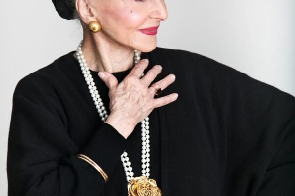
Black in groups: one person in black among colors looks like a hole in the photo; everyone in black looks chic. Coordinate the black — all or thoughtfully placed, never accidental.
The pre-photo check: 30 seconds before the shutter — shoulders angled, chin slightly down, weight on the back foot, genuine smile (think of something funny, not “cheese”). Color gets you noticed; these details get you flattered. In groups, the best-dressed person is often just the best-prepared one.
What Not to Wear on Camera
Neon and fluorescents: they overwhelm the camera’s sensor and cast color onto your skin — the photo adjusts exposure for the shirt, not your face.
Busy small patterns: tight stripes, small checks, and herringbone create moiré — the wavy interference pattern that ruins video and photos. Larger patterns are safe; micro-patterns are not.
All-white in bright sun: blows out to pure white with zero detail — you become a glowing shape. Off-white or cream photographs better.
All-black in dim light: the opposite problem — you disappear into shadow. Add a lighter element near the face.
Logos and text: they date the photo instantly and draw the eye away from you. The camera loves simplicity — give it less to process, and it gives you a better photo.
Key Takeaways
- Jewel tones (emerald, sapphire, burgundy) flatter almost everyone on camera.
- Solids beat patterns; contrast with your skin without extremes.
- Avoid neons (sensor blowout) and muddy tones that flatten.
- Consider the background — contrast with the setting, not camouflage.
- Fit, matte fabrics, and posture matter as much as color.
The Bottom Line
Colors that make you look good in photos: rich jewel tones, solid and saturated, contrasting (not clashing) with your skin and background. Test with a natural-light selfie — ten seconds of testing beats years of washed-out photos. The camera doesn’t lie, but it does reward preparation.